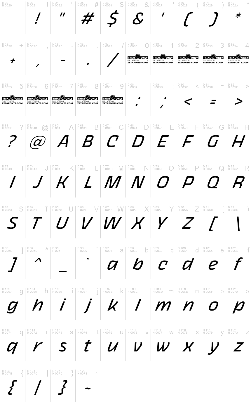
Thicker Trial Regular Italic
TrueTypePre osobnú potrebu
- Akcenty (čiastočné)
- Akcenty (plné)
- Euro
Thicker-Regular-Italic-trial.ttf
Tagy
Poznámka autora
The font here is for PERSONAL/NON-COMMERCIAL USE ONLY!
To download the full font family (all weights, glyphs and numbers) and acquire the commercial license please visit our website:
https://zetafonts.com/thicker
For more info about our licenses:
https://www.zetafonts.com/licensing
CONTACT US:
website: https://www.zetafonts.com
have a question?: info@zetafonts.com
---
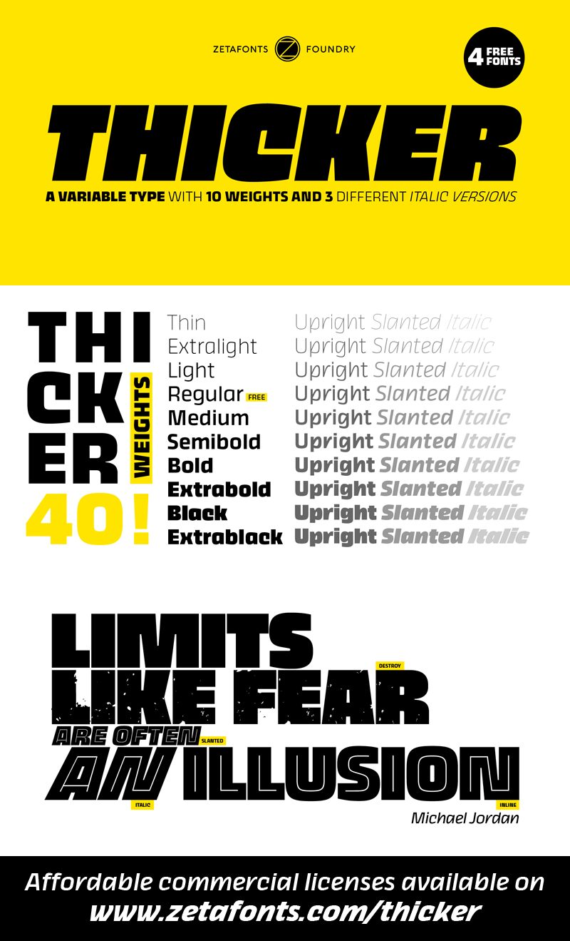
Thicker is a type-family designed for Zetafonts by Francesco Canovaro with Andrea Tartarelli. A geometric sans typeface on steroids, it was first designed in the muscular extrablack weight with the aesthetics of high-power dynamic typefaces used in sports communication, and then developed in the lighter weights where the shapes show some vintage-inspired proportions and the slightly squared look that nods to Novarese famous Eurostile, eponymous with retro-futurism.
With these diverse influences the typeface allows for both impressive display use and effective logo design as well as more fine-tuned editorial use in body text - with a natural inclination for effective and powerful advertising. Sports typography usually uses italics to add dynamism and impact, and Thicker complies with this by offering a choice of three alternate italic forms with different slant, made even more customizable by the inclusion of variable font technology that allows fine tuning of the weight range as well as precise choice of typeface slant.
In each of the 44 weights of the typeface family (as well as in the all-in-one variable type solution) Thicker offers a extended charset of over 900 latin, cyrillic and greek glyphs, covering over two hundred languages and including useful Open Type features (Alternate forms, Positional Numerals, Small Caps and Case Sensitive Forms) for flawless typesetting.
Znaková sada
Pomocou rozbaľovacieho menu si môžete pozrieť kompletnú ponuku znakových sád.

Základné informácie
Rodina písma
Thicker Trial
Podrodina písma
Italic
Unikátna identifikácia podrodiny
1.000;UKWN;ThickerTrial-RegularItalic
Celý názov písma
Thicker Trial Regular Italic
Verzia tabuľky názvu
Version 1.000
Postskriptový názov písma
ThickerTrial-RegularItalic
Zmienka o ochrannej značke
Kicker is a trademark of Cosimo Lorenzo Pancini & Francesco Canovaro.
Výrobca
Dizajnér
Popis
Copyright (c) 2017 by Cosimo Lorenzo Pancini & Francesco canovaro. All rights reserved.
Rozšírené informácie
Podporované platformy
PlatformaKódovanie
UnicodeUnikód 2.0 a nasledovná sémantika, len BMP unikód
MicrosoftLen BMP unikód
Podrobnosti
Vytvorené2019-12-09
Revízia1
Počet znakov583
Jednotiek na Em1000
Práva vloženiaVloženie povolené len na prezretie a tlač
Klasifikácia rodinyBez pätiek
VáhaStredne ľahké
ŠírkaStredné (normálne)
Mac štýlPodčiarknuté
SmerZnaky smerované zľava doprava + neutrály
Štýl vzorkyKurzíva
RoztečRôzna
Kompletný balík obsahuje 8 druhy písma:
Thicker-Regular-Italic-trial.ttf
Thicker-Regular-trial.ttf
Thicker-Black-Upright-trial.ttf
Thicker-Black-Italic-trial.ttf
Thicker-Black-Slanted-trial.ttf
Thicker-Black-trial.ttf
Thicker-Regular-Slanted-trial.ttf
Thicker-Regular-Upright-trial.ttf
Thicker-Regular-trial.ttf
Thicker-Black-Upright-trial.ttf
Thicker-Black-Italic-trial.ttf
Thicker-Black-Slanted-trial.ttf
Thicker-Black-trial.ttf
Thicker-Regular-Slanted-trial.ttf
Thicker-Regular-Upright-trial.ttf
Thicker Trial Regular
TrueTypePre osobnú potrebu
Thicker Trial Black Upright
TrueTypePre osobnú potrebu
Thicker Trial Black Italic
TrueTypePre osobnú potrebu
Thicker Trial Black Slanted
TrueTypePre osobnú potrebu
Thicker Trial Black
TrueTypePre osobnú potrebu
Thicker Trial Regular Slanted
TrueTypePre osobnú potrebu
Thicker Trial Regular Upright
TrueTypePre osobnú potrebu
