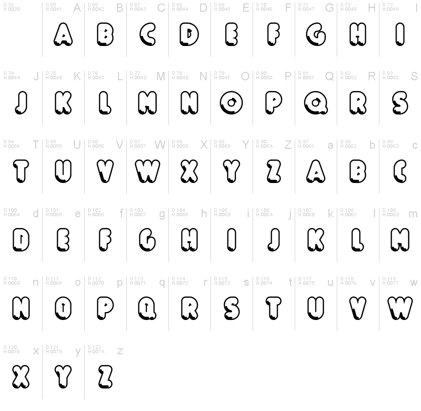
Boule Reduced Contour
TrueTypePre osobnú potrebu
BouleReduced-Contour.ttf
Tagy
Poznámka autora
Boule Reduced Contour font is a cool groovy typeface designed by ingoFont.
BOULE
Capitalized, GEOMETRIC, bold and ROUND.
If the typographer sees a font like that, it's enough to make his toes curl. But sometimes it just has to be that way.
Geometrically constructed fonts do not necessarily have to be pointed and angular; It also works consistently around. And if I say it consistently, then in this case, that's done consistently.
The basis for the BOULE is the circle. The letters are drawn with constant line width, the corners and endings all have the same radius, the lines are all the same thickness.
The BOULE consists only of capitals. There is only one difference in the use of uppercase and lowercase letters: in the uppercase letters, the round letters are circular, while the lowercase letters are narrow.
The Boule is not only very fat, it also runs very tight; that is, the glyphs are very close to each other. To avoid "holes" due to unfortunate letter combinations, the Boule contains ligatures for FT, ST, TT and TZ.
There are also other versions of the font: Boule Brillant on the one hand. In this version, simple highlights simulate a light incidence from the top right. These light edges give the font a decorative effect that makes it easy to think of wet sausages or balloons in some shapes.
And finally the Boule Contour. As the name implies, it is the outer contour of the letters, combined with a shadow at the bottom left.
The name Boule (French for ball) says it already: this font is globated. Therefore, it is also very suitable for all three-dimensional alienation effects. With simple light and shadow you can achieve a very convincing 3D effect with little effort.
Znaková sada
Pomocou rozbaľovacieho menu si môžete pozrieť kompletnú ponuku znakových sád.

Základné informácie
Zmienka o autorských právach
Copyright (c) 2019 by Ingo Zimmermann. Alle Rechte vorbehalten.
Rodina písma
Boule Reduced
Podrodina písma
Contour
Unikátna identifikácia podrodiny
IngoZimmermann: Boule Reduced Contour: 2019
Celý názov písma
Boule Reduced Contour
Verzia tabuľky názvu
Version 1.015
Postskriptový názov písma
BouleReduced-Contour
Zmienka o ochrannej značke
Boule Reduced Contour ist eine Marke von Ingo Zimmermann.
Výrobca
Dizajnér
Popis
Copyright (c) 2019 by Ingo Zimmermann. All rights reserved.
Rozšírené informácie
Podporované platformy
PlatformaKódovanie
UnicodeUnikód 2.0 a nasledovná sémantika, len BMP unikód
MacintoshZápadné (roman)
MicrosoftLen BMP unikód
Podrobnosti
Vytvorené2019-04-20
Revízia1
Počet znakov54
Jednotiek na Em1000
Práva vloženiaVloženie pre trvalú inštaláciu
Klasifikácia rodinyBez klasifikácie
VáhaVeľmi tučné
ŠírkaZúžené
Mac štýlŠikmé
SmerZnaky smerované zľava doprava + neutrály
Štýl vzorkyObrysový
RoztečRôzna
Kompletný balík obsahuje 3 druhy písma:
BouleReduced-Contour.ttf
BouleReduced-Brillant.ttf
BouleReduced-Gras.ttf
BouleReduced-Brillant.ttf
BouleReduced-Gras.ttf
Boule Reduced Brillant
TrueTypePre osobnú potrebu
Boule Reduced Gras
TrueTypePre osobnú potrebu
