Ode an Erik AH
TrueTypeGNU/GPLAktualizovaný
- Akcenty (čiastočné)
- Euro
Ode-Erik.ttf
Tagy
Poznámka autora
Ode an Erik, designed by FontGrube AH, is a striking brush-style typeface that exudes a captivating blend of vintage charm and modern flair. Inspired by the title graphics of classic German TV police series from the 1960s and 70s, this font boasts a bold, expressive personality that commands attention. Its robust strokes and dynamic curves convey a sense of movement and energy, evoking a feeling of intensity and drama.
This versatile font lends itself beautifully to a wide range of design applications, from bold headlines and impactful branding to eye-catching signage and captivating editorial pieces. Its strong character and multi-language support make Ode an Erik an excellent choice for projects that require a distinctive, attention-grabbing typographic treatment.
This versatile font lends itself beautifully to a wide range of design applications, from bold headlines and impactful branding to eye-catching signage and captivating editorial pieces. Its strong character and multi-language support make Ode an Erik an excellent choice for projects that require a distinctive, attention-grabbing typographic treatment.

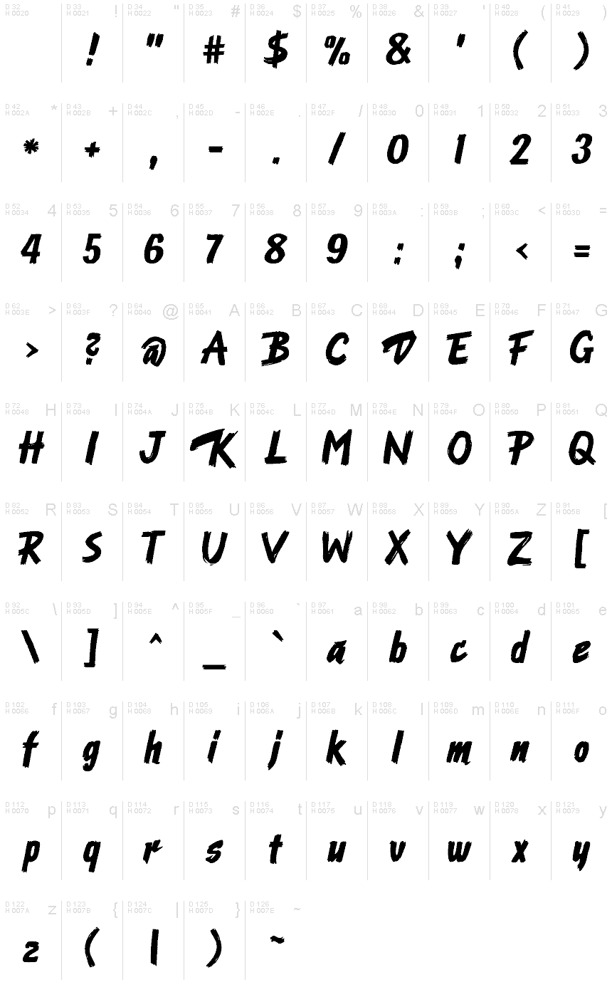
Znaková sada
Pomocou rozbaľovacieho menu si môžete pozrieť kompletnú ponuku znakových sád.

Základné informácie
Zmienka o autorských právach
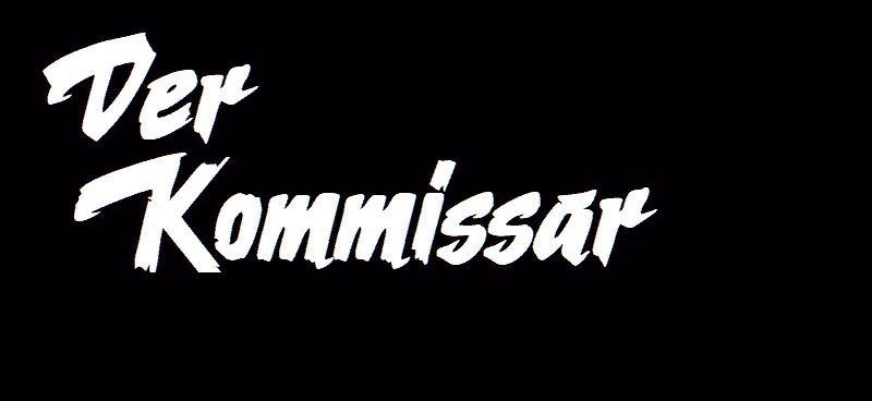
Nach dem Logo der Krimiserie "Der Kommissar" mit Erik Ode
Rodina písma
Ode an Erik AH
Podrodina písma
Regular
Unikátna identifikácia podrodiny
Ode an Erik AH
Celý názov písma
Ode an Erik AH
Verzia tabuľky názvu
Version 2.00
Postskriptový názov písma
OdeanErikAH
Výrobca
Fontgrube AH
Popis
This typeface originates in the Title graphics of the German TV police series "Der Kommissar" (The Police Commissioner) broadcast in 1969 to 1976.
The graphic title consists of fast, bold brush strokes and was hand-made. The letters were scanned and digitized, and from that material almost all of the lowercase characters could be derived. Uppercase and figures took inspiration from other sources which were adapted to fit the general character of the typeface.
The font works with many (mainly West-)European languages, such as English, German, French, Spanish, Italian, Portuguese, Danish, Swedish, Norwegian, Islandic and Turkish.
The name of the font alludes to the actor who played the main charakter, Erik Ode. In English it means "Ode to Erik".
Licencia
Ode an Erik AH is available as a free font under the SIL Open Font License with the reserved name “Ode an Erik”. For details see https://scripts.sil.org/OFL
URL licencie
Rozšírené informácie
Podporované platformy
PlatformaKódovanie
UnicodeUnikód 1.0 sémantika
MacintoshZápadné (roman)
MicrosoftLen BMP unikód
Podrobnosti
Vytvorené2024-04-24
Revízia1
Počet znakov230
Jednotiek na Em1000
Práva vloženiaVloženie pre trvalú inštaláciu
Klasifikácia rodinyPísané (skriptové)
VáhaTučné
ŠírkaStredné (normálne)
ŠírkaNormálny
Mac štýlTučné
SmerZnaky smerované zľava doprava + neutrály
Štýl vzorkyKurzíva
DržanieVzpriamené
Šírka ťahuNormána
RoztečRôzna
Súbor symbolovWindows 3.1 ANSI